MOCA BRAND GUIDELINES
Our brand represents who we are, so please always treat it with respect. The MOCA logo consists of a word mark which includes an "O" symbol. If you use our logo, you agree to comply with the MOCA Brands Terms and Conditions.
BASIC RULES
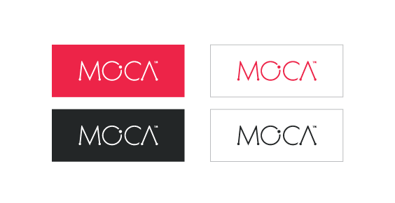
Depending on the background you’re working with, different variations of the logo may be used. The white-colored logo should always be used on red and gray backgrounds.

LOGO CLEAR SPACE
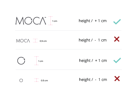
If you use the MOCA logo, you should be care about spaces. Keep a security space between logo and other graphic elements. Minimum, it should comply with the width proportion of MOCA letter "o". Also, you have to take care of the logo proportions. It is very important that you don't reduce it more than one centimeter because it would lost his visuality and consistence.


COLOR GUIDELINES
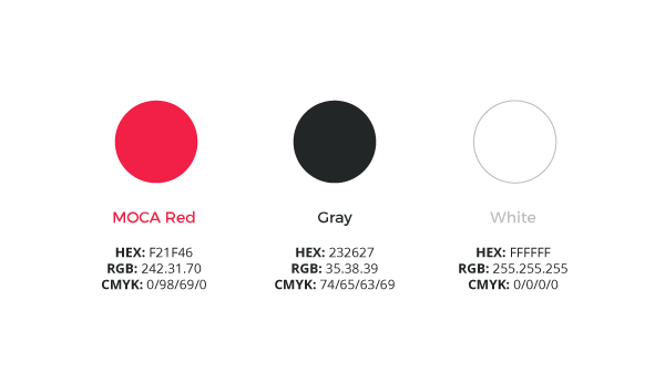
The MOCA logo must be reproduced in full color, White, Red or Gray. The colors for all applications have to match the RGB, code HEX or CMYK (print) using the specifications provided here:

INCORRECT USAGE
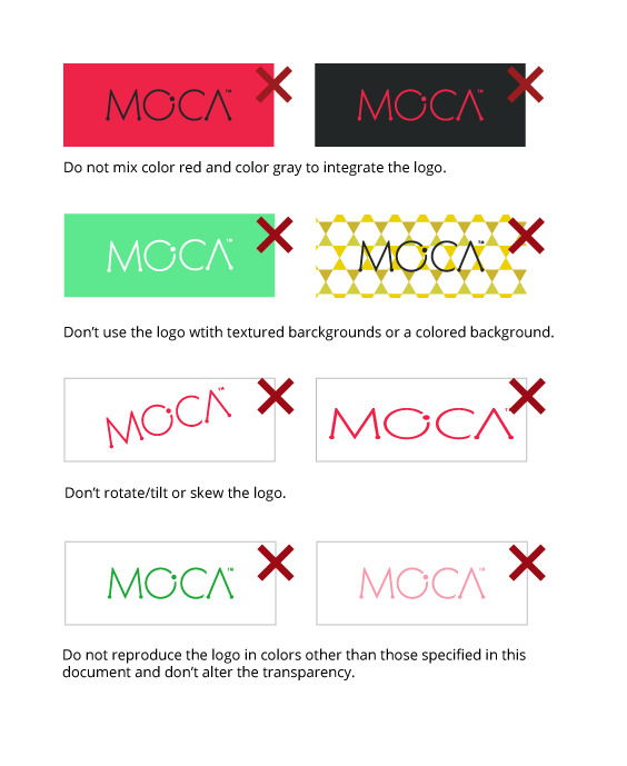
The MOCA logo should always be treated with respect, so make sure you don’t change or recreate it. You don't need to reinvent the wheel - please download the official MOCA logo from the Logo Assets so you know you have the correct final artwork.


